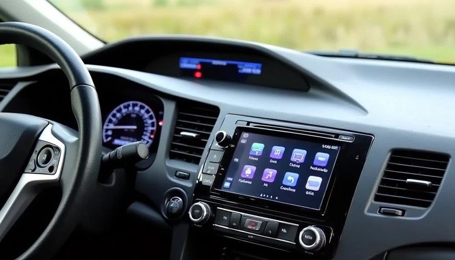
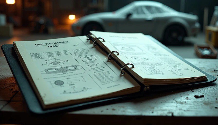
I found it in a box in my basement last week. A binder. One of those heavy-duty three-ring things with the clear plastic cover. The label on the spine, written in my own handwriting from eight years ago, said: "HMI Proposal — 2018 — Do Not File."
I opened it. And there it was. The cockpit I designed in my spare time, refined over three years, and pitched to my manager three times. Three times I stood in a conference room in Novi, pointing at slides, explaining why this was the right direction. Three times I was told: "It's not what the customer wants."
The binder is sixty-three pages of diagrams, wireframes, and engineering justifications. Reading it now, I can see the flaws. Some of the ideas were naive. Some of the technology wasn't ready. But the core concept — the thing I was trying to build — was right.
And it never saw the light of day.
This is the story of the cockpit I pitched three times and never got approved. It's not a product review. It's not a retrospective. It's a confession from the engineer who tried to do better and couldn't make it happen.
The Problem I Was Trying to Solve
In 2017, I was working on the HMI for a major automaker's next-generation infotainment system. The requirements document was 200 pages long. It listed every feature the car needed: navigation, audio, phone, climate, vehicle settings, driver assistance, and about forty other functions I've since forgotten.
What it didn't list was how all these features would work together. The requirements were written by product managers who had never built a software system, who had never watched a driver struggle with a hidden menu, who had never sat in traffic with a screaming child and a phone that wouldn't connect.
The system we were building was feature-rich and function-poor. It had everything and nothing. It was designed by committee, optimized for checkboxes, and user-tested in quiet rooms with paid participants who had never driven a car on a real road.
The more I worked on it, the more frustrated I became. So I started sketching.
The Proposal: Three Principles
My proposal was built on three principles:
1. Context over menus. Most drivers use only a handful of features regularly. The system should learn which features you use and surface them proactively, rather than making you dig through menus to find them.
2. Voice as primary, touch as secondary. In 2018, voice recognition wasn't good enough to be the primary input. But it was good enough to reduce the number of taps. I proposed a hybrid model: use voice for high-cognitive-load tasks (navigation entry, complex queries) and touch for simple adjustments (temperature, volume).
3. Safety by design. Every feature should be usable without taking your eyes off the road for more than one second. If a function required more than three seconds of visual attention, it shouldn't be in the cockpit — it should be in the phone app, where you could use it when parked.
The Design: What I Actually Proposed
The layout: A single high-mounted 12-inch screen, placed at the same height as the instrument cluster. Below it, a row of physical buttons for climate, volume, and home — functions you need to access without looking.
The home screen: A persistent "dashboard" with three zones: navigation (left), media (center), and climate/phone (right). Each zone was resizable and customizable, so you could make the map bigger on road trips or the media controls bigger when you're parked with the kids.
The voice layer: A dedicated button on the steering wheel that invoked a context-aware voice assistant. Press it once, and the system listened. Press it twice, and it opened a "quick command" menu with shortcuts for common tasks. The assistant could understand natural language: "Find a gas station with good reviews on the way to Traverse City" rather than "Navigate to gas station."
The learning system: The cockpit would observe your behavior and adapt over time. If you always adjusted the temperature two degrees up in the morning, the system would pre-warm the cabin before you left. If you always called your spouse after 5 p.m., the system would suggest the call on the home screen. It was privacy-first — all learning happened locally, on the car's hardware, with nothing sent to the cloud.
The "Maya" mode: This was my favorite idea. A simple toggle at the top of the screen that switched the interface to "family mode." Voice prompts were louder, with clearer enunciation. The screen was locked to prevent accidental inputs from the backseat. Navigation prioritized kid-friendly stops — rest areas, fast food, and places with playgrounds. The climate controls optimized for backseat airflow. I called it "passenger mode" in the proposal. I was thinking about Maya before Maya existed.
The Rejections: Three Reasons, Three Years
2016: "It's not what the customer wants."
The first rejection was the most direct. My manager looked at my slides and said: "The customer wants a bigger screen and more features. They don't want to learn a new way of doing things. This is too different."
I argued that customers didn't know what they wanted until they saw it. He nodded, thanked me for my time, and closed the binder.
2017: "It's too expensive."
By 2017, I'd refined the proposal. I'd replaced the learning system with a simpler version that didn't require machine learning hardware. I'd removed the AR features that were still too expensive.
"Alex, we can't build this for the target cost," my manager said. "The hardware alone would add $200 per car. We're already over budget."
I told him the learning system could be done in software, on the existing processor. He said, "We don't have the development resources."
2018: "It's not a priority."
The third rejection was the quietest. I submitted a final version, with all the cost-cutting changes. I got a one-line email back: "Thanks, Alex. We'll keep this in mind for future programs. Right now, we're focused on getting the current system to production. No capacity for new initiatives."
I closed my laptop. I didn't submit another proposal. A year later, I left Harman.
The Irony: What I Pitched Is Now Everywhere
Reading my 2018 proposal in 2026 is a strange experience. It's not prescient. It's just... inevitable.
The things I proposed — voice as primary, touch as secondary, proactive learning, context-aware interfaces — are now standard in the best cockpits. The 2026 Hyundai Ioniq 6 doesn't have my exact design, but it has the same philosophy. The persistent dashboard. The voice-first interaction. The learning system.
When I tested the Ioniq 6 for this site, I felt a weird sense of déjà vu. This is what I was trying to build. Not the hardware. Not the specific colors or fonts. The philosophy. The idea that the cockpit should adapt to you, not the other way around.
The joke is that the Ioniq 6 doesn't exist because of the proposal I wrote. It exists because Hyundai spent years and millions of dollars developing the same ideas — and because the technology finally caught up to the vision.
What I Got Wrong
The proposal wasn't perfect. I'm not claiming it was.
Voice recognition wasn't ready. In 2016, the voice models I was proposing would have been frustrating. Google Assistant in 2026 is good. Google Assistant in 2016 was a toddler. I underestimated how long it would take to get voice right.
The learning system was naive. My idea of local learning on the car's hardware was technically possible, but the processing power was limited. I didn't fully appreciate the hardware constraints.
I underestimated the cost. My manager wasn't wrong about the cost. Building a modern cockpit from scratch is expensive. The Ioniq 6's system is the result of years of investment. My proposal would have cost more than I thought.
Why I'm Writing This Now
This is the hardest thing I've written for this site. I'm not mad anymore. I've moved on.
The binder is in the basement. The Miata is in the garage. Jenna is at the hospital. Maya is asleep. I'm sitting in my workbench, writing about a proposal that never left the room.
This essay is about closure. And about a lesson that took me years to fully grasp: good ideas don't always make it to production. The world is full of smart engineers who knew better, who had better ideas, who were right — and who were ignored.
Some of them left. Some of them stayed. Some of them became the grumpy old engineers who complain about how things used to be. I didn't want to be that guy. That's why I left.
But I also don't want to pretend the proposal was perfect. It wasn't. It was the work of a passionate engineer who was trying to solve a problem that the rest of the industry was also trying to solve. I just happened to be a few years early.