I spend a lot of time judging screens by whether they still work when a driver is tired, the kid in the back wants a different song, and the road noise is fighting every tap. That is why the android auto media player redesign matters more than it sounds. On paper, it is a simple card with album art and play controls. In practice, it is where a driver checks what is playing, changes sources, hunts for a podcast, and does all of that without looking down for too long. A good redesign should make the music easier to manage in five seconds, not turn the whole display into a shiny poster. If the interface slows down the moment you want to skip a track, it has already failed the test.
Why the android auto media player redesign keeps disappointing drivers
The weak spot is usually hierarchy. A lot of current media views treat the center of the screen like a billboard first and a control panel second. Album art gets the big rectangle, the track title gets one line, the source name gets buried, and the most useful buttons end up in small targets that are annoying at speed. That is fine on a phone held inches from your face. It is not fine in a cabin where the screen sits farther away, the cabin is vibrating, and your eyes need to get back to the windshield fast. Android Auto also has to fit inside a lot of different dash shapes, so the safest design choice is often the blandest one. The result is a player that looks polished in a screenshot and clumsy on a commute.
A serious android auto media player redesign starts by admitting that audio is not decoration. It is a task. A driver wants three things immediately: what is playing, what is next, and how to get out of the current app without hunting for tiny icons. The current design often makes those actions feel separate, even though they happen together every time you get in the car. That is why the interface can look modern and still feel one step behind the person using it.
What a useful redesign changes in the real cabin
The best move is to shrink the pretty stuff and expand the useful stuff. Bigger skip and play buttons matter more than a giant image. Source switching should be obvious enough that a driver can jump from Spotify to a podcast app without reading a menu tree. The queue should be one tap away, not hidden under a three-dot icon that feels borrowed from a phone app. When I test systems in a family SUV, the versions that work best keep the current track visible, keep the next action visible, and leave enough screen space for the map if navigation is also running. That is the whole trick: the media surface should cooperate with the rest of the cockpit instead of competing with it.
A thoughtful android auto media player redesign would also do a better job with typography. The name of the song or episode should be readable at a glance, but so should the app and the playback state. Thin fonts and low-contrast gray text look elegant in a studio. In a bright cabin with polarized sunglasses, they look like a mistake. The interface should also respect steering wheel controls as first-class inputs. If the user already has a thumb switch that can skip, pause, and change volume, the screen should not force a redundant tap for every common action. That is how you make a system feel calm instead of busy.
Where the redesign breaks down after dark, in winter, and on bad roads
This is where the lab demo falls apart. Capacitive touchscreens get worse when your hands are cold, dry, or gloved. Wireless Android Auto can also add a few beats of startup lag, which does not sound like much until the playlist fails to resume before you leave the driveway. Then there is vibration. A button that feels large enough when parked can become fiddly once the vehicle is moving over cracked pavement or salted winter roads. In those moments, a physical volume knob or a strong steering-wheel control path is not nostalgia. It is good interface design.
A real android auto media player redesign has to plan for those ugly details. It should not assume perfect hands, perfect weather, or perfect attention. It should recover cleanly when the phone reconnects, keep playback state obvious after a brief dropout, and avoid burying the most common commands behind extra taps. That is the difference between a media screen that looks finished and one that behaves finished.
Why OEMs keep getting the media layer wrong
The short version is that Android Auto is a projection layer, not a blank canvas. The phone app and the car both have to play by rules about safety, layout, and app certification, so the carmaker has less freedom than most people assume. That is why you see similar media behavior across brands even when the rest of the dashboard looks different. A supplier can tweak theme colors, screen proportions, and button placement, but it cannot casually reinvent the whole experience without risking compatibility or a long approval cycle.
There is also a business reason. Every extra custom feature means more testing across different screen sizes, software versions, and phone models. A clean, conservative design is cheaper to support than a clever one. That is one reason some automakers end up with interfaces that feel technically correct and emotionally flat. The engineering team is trying to avoid edge cases, not delight a reviewer. Unfortunately, drivers live in the edge cases: one hand on the wheel, one coffee in the console, and a child asking for the next song.
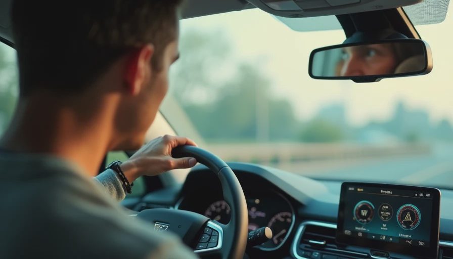
How to judge the redesign before you buy the car
If you want to know whether a system is genuinely better, do not spend five minutes staring at the home screen in the showroom. Start a playlist, skip forward twice, open a podcast, then switch back to music without using your phone. Try it again with navigation on the display so you can see whether the media panel still leaves enough room for maps. Then use the steering wheel buttons and see whether the screen state stays honest, or whether it makes you guess what changed. If the salesperson lets you stay parked for a minute, reconnect the phone and see how fast the player returns to the same app and the same source.
I would also pay attention to the little things. Can you read the track text in bright daylight? Is the album art useful or just decorative? Does the queue show up fast enough to matter? Can you recover from a missed touch without starting over? Those are the questions that separate a slick demo from a screen you will not hate after the first month. If a brand has a reputation for clean smartphone integration, that is a good sign, but the only real test is your own thumb and your own eyes.
Alex's verdict on the android auto media player redesign
The best version of this feature is not dramatic. It is quiet, obvious, and hard to mess up. If the system lets you see what is playing, change it quickly, and get back to the road with almost no thinking, it is doing its job. If it turns into a glossy album-art gallery with tiny controls buried underneath, it is wasting screen space you will use every single day. That is the whole bar. Bench-tested. Kid-tested. If you are comparing vehicles, treat the media screen like a daily appliance, because that is exactly what it is.