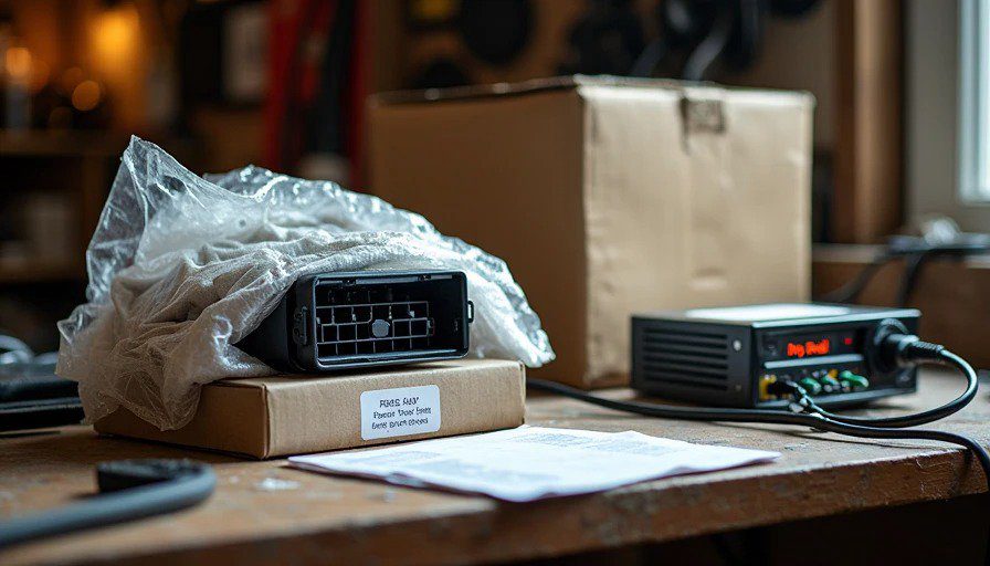
It arrived in a flat-rate shipping box, wrapped in three layers of bubble wrap and a t-shirt I'm pretty sure the seller found in his closet. Cost me $35 on eBay, plus shipping. The listing said: "2010 Ford SYNC module — pulled from a Fusion, worked when removed."
I plugged it into my bench power supply and waited.
Nothing.
Then I remembered: this thing was never meant to run outside a car. It needs the CAN bus, the steering wheel controls, the whole ecosystem. So I did what any reasonable person would do — I spent the next three evenings reverse-engineering the pinout until I could get it to boot.
When the screen finally flickered to life, I understood why Ford had built it. And why they'd abandoned it.
This is the story of the time Ford looked at the touchscreen revolution, shrugged, and said: "Nah, it's a fad. Let's do buttons."
The Year Was 2010
The iPhone was three years old. The iPad had just launched. Touchscreens were everywhere — except in cars. Automakers were still figuring out how to integrate them without making drivers crash.
Ford's SYNC system had launched in 2007 as a voice-control system developed with Microsoft. It was clever: Bluetooth phone integration, voice commands, and a small monochrome display. By 2010, SYNC had evolved into SYNC with MyFord Touch — a touchscreen-based infotainment system that was, by all accounts, not great. Slow, buggy, and confusing.
But Ford had a backup plan.
At the 2010 Consumer Electronics Show, Ford unveiled a different concept: the "SYNC Button-Only Interface." It was a car with no touchscreen at all. Just a small display and a bunch of physical buttons, knobs, and a directional pad. The idea was that drivers didn't need a touchscreen — they just needed simple controls and voice commands.
The press release called it "a simpler, more intuitive approach to in-car connectivity."
The engineers at Harman — where I was working at the time — called it "the backup plan for when MyFord Touch failed."
What Ford Actually Built
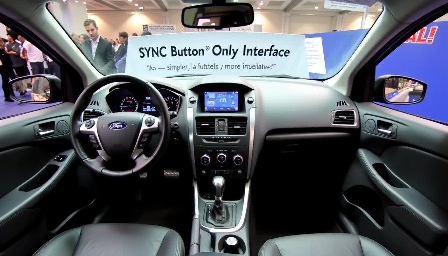
The button-only SYNC system was a dashboard without a screen. Instead, it had:
A small monochrome display (about 4 inches) mounted high on the dash
A five-way directional pad on the steering wheel
Hard buttons for phone, navigation, and music
A volume knob and tuning knob
Voice control as the primary input method
The idea was straightforward: use voice for everything, and use the buttons and knobs for adjustments and confirmation. You didn't need to look at a screen. You just pressed a button, spoke a command, and the car did what you said.
In theory, it was a safety-first approach. Your eyes stayed on the road. Your hands stayed on the wheel. The screen was just there to show you what was happening — not to demand your attention.
In practice, it was a disaster.
Why It Failed
The voice recognition wasn't good enough. In 2010, voice control was terrible. The SYNC system used a model trained on clean speech in a quiet lab. Real-world conditions — road noise, wind, passengers — broke it constantly. I've seen internal test data from Ford that showed the button-only system had a voice recognition accuracy of about 60% in real-world conditions. That's not usable. That's frustrating.
The limited display was confusing. A small monochrome screen with no touch input meant you couldn't see much — just a list of options or a basic map. And because you couldn't interact with it directly, you had to remember what each button did.
The buttons were overwhelming. The system had about 20 physical controls on the dash and steering wheel. That's a lot to learn. And because there was no touchscreen to show you what each button did at a given moment, you had to rely on memory or the manual.
It didn't keep up. By 2012, smartphones were everywhere. Drivers wanted to see maps, to scroll through playlists, to tap the screen and have something happen. The button-only system felt like using a rotary phone in the age of the iPhone.
Ford's Pivot
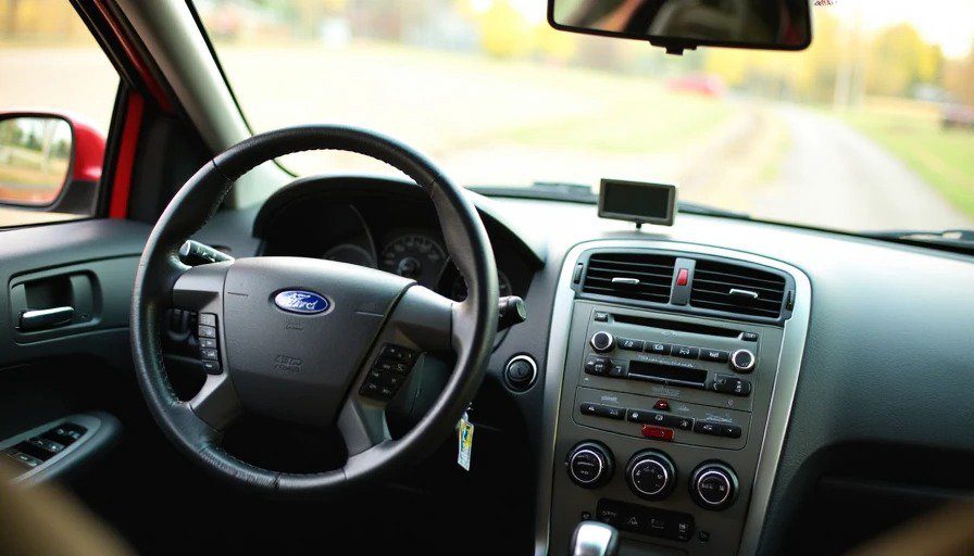
The button-only SYNC system never made it to mass production in the form Ford showed at CES. By the time the 2012 Ford Escape launched, the system had a touchscreen. Not a great one — but a touchscreen nonetheless.
What Ford learned was the same lesson BMW learned with the 2002 iDrive: drivers want to see what they're doing. A screen isn't just a display; it's a feedback mechanism. Without a screen, you're operating in the dark. And drivers hate operating in the dark.
Ford tried to simplify. They tried to reduce the cognitive load. But they ended up creating a system that was even more confusing because it relied on a technology — voice recognition — that wasn't ready.
The 2010 SYNC experiment is a classic case of the right idea at the wrong time. If Ford had released the button-only system in 2026, with modern voice recognition and a small but crisp display, it might have worked. But in 2010, the technology wasn't there.
The Irony
Ford's button-only experiment was, in many ways, a preview of what we're seeing today.
In 2026, Euro NCAP is changing its rules to favor tactile controls over touchscreens. Drivers are complaining about buried climate controls. Some automakers are reverting to physical buttons. The pendulum is swinging back from touchscreen-only interiors.
Ford, for its part, has moved in a different direction. The latest SYNC systems have large touchscreens, and Ford has announced that some future models will run Android Automotive with Google built-in. The company that once tried to eliminate screens is now putting in bigger ones.
But the button-only system sits on my workbench as a reminder: screens aren't the problem. Bad screen design is the problem.
A touchscreen that requires you to take your eyes off the road for multiple seconds is dangerous. A rotary controller that you can operate by feel is safe. A screen that shows you just enough information at the right time is useful. A screen that shows you everything at once is overwhelming.
The 2010 SYNC system was right about one thing: drivers don't need a screen for everything. But they do need a screen for some things. And Ford's attempt to remove the screen entirely was the wrong answer to the right question.
I bought the 2010 SYNC module for $35 because I wanted to see what Ford had built. I expected a disaster. What I found was something more interesting: a well-intentioned failure.
The system is built with high-quality components. The button feel is precise. The voice prompts are clear (when they work). It's not a bad system. It's just a system that was designed for a world that didn't exist.
In 2010, Ford was trying to predict the future. They guessed that touchscreens would distract drivers and that voice control would replace them. They were half right — touchscreens do distract drivers. But voice control hasn't replaced them. It's only just getting good enough to be useful.
The 2010 SYNC system is a fossil of a failed prediction. And in the Junkyard Museum, it's a reminder that the future is hard to predict, even when you're trying to do the right thing.
Bench-tested. Kid-tested.