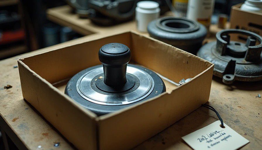
It sits on my workbench in a shallow cardboard box, right next to the Miata's old brake calipers and a half-empty bottle of brake fluid. I pulled it from a junkyard in Detroit last fall — twenty bucks, no questions asked. The plastic is scuffed, the chrome ring around the base is worn down to bare metal, and the rotary encoder still clicks with that satisfying, mechanical precision that modern systems can't quite replicate.
It's a 2002 BMW E65 iDrive controller. The first one. The knob that launched a thousand complaints.
If you were around in the early 2000s, you remember the outrage. BMW replaced physical buttons with a single rotary knob and a screen. The press hated it. The customers hated it. Car and Driver called it "confusing and distracting." The New York Times said BMW "betrayed its driver-focused heritage." Forum threads filled with rants about menus, submenus, and the sheer audacity of making drivers scroll through a screen to adjust the climate control.
But here's the thing I keep coming back to, sitting in my garage, spinning this knob with nothing attached to it: the iDrive controller was right.
It was ahead of its time, and the industry punished it for it. Not because it was poorly engineered — it wasn't — but because it asked drivers to learn something new. And drivers don't like learning new things in their cars.
The Problem BMW Was Trying to Solve
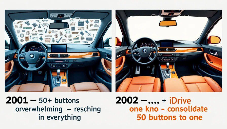
In 2001, the average luxury car had about 50 buttons on the dashboard. By 2002, with the E65 7 Series, BMW had added navigation, a phone, a CD changer, and a trip computer. The dashboard was becoming a wall of switches, knobs, and cryptic symbols.
The iDrive system consolidated all of those buttons into a single rotary controller mounted on the center console. Spin it to scroll, press it to select, push it left or right to navigate between screens. The screen was mounted high on the dash, at eye level. The knob was within arm's reach. The idea was simple: instead of reaching for 50 buttons, you reach for one.
In a 2002 interview, BMW's head of interior design said: "We realized we couldn't keep adding buttons. The car would eventually have a wall of them. So we created a system that could grow with technology, not fight it."
That was prescient. It was also catastrophic for customer satisfaction.
What BMW Got Right
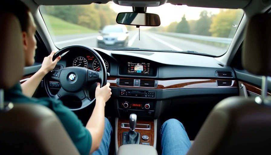
1. The placement was brilliant. The iDrive screen is mounted high on the dashboard, at the same height as the instrument cluster. You don't have to look down to see it. The controller sits on the center console, exactly where your hand falls naturally when it rests on the armrest. Your eyes stay on the road. Your hand stays in one place.
The 2026 Honda Civic I reviewed last week uses the same basic layout — screen high, controls down. BMW figured this out in 2002.
2. The tactile feedback was perfect. The rotary controller has a distinct, mechanical click for every detent. You can feel each menu item as you scroll past it. The force required to press the knob is calibrated precisely — not too light, not too heavy. It feels like a precision instrument, not a toy.
Modern systems have tried to replicate this with haptic feedback, but they haven't matched it. There's something about the physicality of a well-made encoder that digital emulation just can't reproduce.
3. The menu structure was logical (eventually). The early software had bugs. The European version was better than the US version. But the menu structure itself — hierarchical, predictable, consistent — was a solid foundation. Once you learned the mental map, you could navigate without looking. And I've driven enough cars with awful touchscreen menus to know that BMW's approach was fundamentally sound.
What BMW Got Wrong
1. The learning curve was brutal. BMW didn't do enough to teach drivers how to use the system. The manual was thick. The in-car tutorial was slow. And drivers didn't want to read a manual — they wanted to get in the car and drive. When they couldn't figure out how to adjust the climate control, they blamed the knob.
2. The rotary controller wasn't discoverable. Unlike buttons with labels, a rotary knob doesn't tell you what it does. You have to explore. And the early iDrive software had so many functions buried at different depths that even simple tasks required memorization.
3. BMW cheaped out on the screen. The 2002 iDrive used a 6.5-inch screen with a resolution that was fine for 2002 but terrible in direct sunlight. The glare was brutal. The contrast was poor. BMW mounted a state-of-the-art controller behind a budget display.
4. The hardware couldn't keep up. The early iDrive systems were slow by today's standards — and slow by 2002 standards, too. The menu transitions stuttered. The map redraws lagged. The system was ambitious, but the silicon couldn't deliver.
Why the iDrive Controller Failed (and Why It Didn't)
The iDrive controller was a victim of timing.
In 2002, smartphones didn't exist. Touchscreens were resistive and terrible. Voice control was a joke. The tech wasn't ready for the interface BMW was trying to build. But the vision — a single, physical input device for a digital cockpit — was exactly right.
And in the years since, the industry has basically agreed. BMW didn't abandon the rotary controller — they refined it. Today's iDrive is a hybrid system: rotary controller, touchscreen, voice, and gesture control. It's the most flexible cockpit interface on the market. And the rotary controller remains the center of it.
Because here's what BMW's engineers understood that many still don't: a touchscreen is great for some things and terrible for others. For browsing a map, a touchscreen is intuitive. For adjusting temperature while you're driving, it's a safety hazard. A physical controller that you can operate by feel will always be better for certain tasks.
The Junkyard Museum Perspective
I keep the 2002 iDrive controller on my workbench as a reminder.
A reminder that good ideas can fail because they're ahead of their time. A reminder that the industry's first attempt at a digital cockpit was met with outrage — and that outrage was more about the shock of change than the quality of the engineering.
And a reminder that today's touchscreen revolution is going through the same cycle. Drivers are complaining about buried climate controls and distracted driving. Euro NCAP is changing its rules. Some automakers are reverting to physical buttons. The cycle continues.
The 2002 iDrive controller wasn't a failure. It was a prototype. And prototypes are supposed to teach you something.
BMW taught the entire industry that a single physical controller can replace 50 buttons — if you get the hardware right, if you get the software right, and if you teach drivers how to use it.
The industry learned the first two lessons. It's still learning the third.
One Final Thought
The next time you adjust the temperature in your car using a physical knob, or navigate a menu using a rotary controller, or appreciate that your screen is mounted high enough to see without looking down — you're experiencing BMW's legacy.
The knob on my workbench isn't working. It's not connected to anything. But it reminds me that the best innovations are the ones that seem crazy until they become obvious.
BMW's iDrive was crazy in 2002. By 2026, it's just obvious.
Bench-tested. Kid-tested.