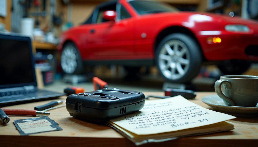
I’m writing this from my garage in Royal Oak, Michigan, at 10:47 p.m. The Miata is up on jack stands — again — and beside me on the workbench sits a 2002 BMW iDrive controller I pulled from a junkyard last month. It’s not plugged into anything. I just like having it around.
My four-year-old daughter, Maya, is asleep inside. My wife, Jenna, just finished a 12-hour shift in the ER at Beaumont and is probably already dreaming about coffee. And I’m out here, staring at a knob that launched a thousand complaints, thinking about why nobody ever reviewed it properly.
Not the car. Not the horsepower. Not the leather stitching. Just the knob. And the screen it controlled. And the 300 milliseconds of lag that made drivers want to throw their keys out the window.
That’s what this blog is about. The screen. The software. The invisible architecture that you touch a hundred times a day — and that most car reviewers spend exactly one paragraph on.
The Problem With Car Reviews
I’ve read hundreds of them. I used to obsess over them when I was at Harman, trying to understand what real owners thought of the systems my team was shipping. And nearly every review follows the same script:
“The infotainment system is responsive and easy to use, with crisp graphics and Apple CarPlay integration. The screen is mounted high on the dash for good visibility.”
That’s it. Four sentences. Buried between a paragraph about suspension tuning and another about cargo space. Meanwhile, you’ll spend 3.7 years of your life — actual statistic — interacting with that screen while you own the car. You’ll poke it in stop-and-go traffic. You’ll squint at it in direct sunlight. You’ll curse it when it takes five seconds to boot and you just want to hear the weather.
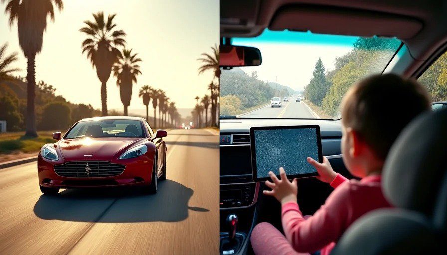
But car reviewers don’t test that. They drive press cars on sunny California roads for two days, with no kids in the back, no grocery bags in the trunk, and no rain. They don’t live with the system. They don’t watch their four-year-old smear yogurt on the display and see if the touchscreen still registers inputs. And they definitely don’t know why a menu takes three extra taps — they just say it’s “a bit cumbersome.”
That’s not good enough.
Why I’m Different (And Why That Matters)
I spent eight years building those systems. At Harman’s Novi campus — 15 minutes up I-696 from my house — I wrote HMI software for BMW iDrive, Toyota Entune, and Stellantis Uconnect modules. I know the cold-boot sequence of QNX better than I know my own garage door code. I’ve sat in more usability tests than I can count, watching real people struggle with menus I helped design.
And here’s the thing: most of the time, the engineers knew the flaws existed. We wrote tickets. We filed internal bug reports. We begged product managers to let us fix the obvious stuff — the hidden climate controls, the buried audio settings, the voice assistant that misunderstood every third command.
But those fixes didn’t ship. Because the hardware was locked 18 months earlier. Because the global platform had to support 20 languages and the English menu strings overflowed in German. Because someone in a boardroom decided that “customers will get used to it.”
In 2022, I walked away. Not because I stopped caring — but because I spent three years proposing the same improvements, and every time I was told: “You’re not the user.”
Fair enough. So now I am.
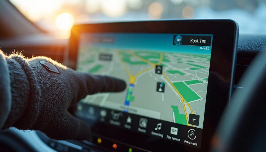
Now I test these systems the way a real driver uses them. With a child in the backseat asking for snacks. With a winter glove on my right hand. With the sun blazing through the windshield at 4 p.m. in July. I don’t get press-loaner cars with 200 miles on them — I borrow my neighbor’s CR-V, or rent a Camry from the airport, or wait until the first owner forums start complaining and then I go find one to test.
And when I tell you a UX decision is baffling, I can tell you why it happened. Not just “it’s bad,” but “it’s bad because the hardware spec was frozen in 2024 and the SoC can’t handle the animation budget, so they dialed down the frame rate to keep boot time under 10 seconds.” That’s the part reviewers never tell you.
What This Blog Covers
Five things, and five things only:
The Cockpit — deep teardowns of factory infotainment, HUDs, digital clusters, voice assistants, navigation UX. I’ll measure boot times, menu depths, glare angles, and CarPlay connection speeds with a stopwatch.
Signal Chain — everything that plugs in. Wireless CarPlay dongles, dash cams, OBD-II scanners, streaming rearview mirrors. Things that upgrade your car’s brain without you buying a new car.
Dad Mode — real-world testing with a preschooler. Voice recognition over the Moana soundtrack. Touchscreen accuracy with sticky fingers. The road-trip navigation stress test with three bathroom detours.
Junkyard Museum — retired head units from eBay and scrapyards. Why the 2002 iDrive knob actually made sense, and where it went wrong. Lessons from failed UX experiments that today’s systems keep repeating.
Alex’s Verdict — scored reviews using a repeatable methodology. Boot time, CarPlay sync speed, glare index, menu depth count, and a “is this dangerous at 45 mph?” check. So you can cross-shop cockpits the way you cross-shop crash ratings.
What I Absolutely Will Not Do
No horsepower talk. No 0–60 times. No opinions on exterior styling or interior leather quality.
No press releases, spy shots, or “upcoming model” speculation. I review cars that are actually on the road, with real software versions owners are stuck with.
No brand flattery. I don’t accept review units from OEMs with strings attached. If a car shows up in my driveway, the keys stay in the ignition, and the check goes back.
No “when I was at Harman” name-drops. My past gives me perspective, not permission to brag.
No scores in headlines. The Verdict category uses scores internally, but I won’t turn this into a ranking list — you’ll find the number in the article, where you can see the full breakdown.
The Promise
This blog exists because the cockpit deserves the same depth of analysis we give engines and suspensions. Because the screen is the only part of the car you touch every single time you drive. Because “responsive and easy to use” is a lazy sentence, and you deserve better.
I’m not here to save the world. I’m here to save your thumb — one unnecessary tap at a time.
Bench-tested. Kid-tested.